RemoteBB — Brand Studio
CANNAHELP
Brand Identity Exploration · 10 Logo Variations
V5 — Arched Baseline Refined
Starting Point

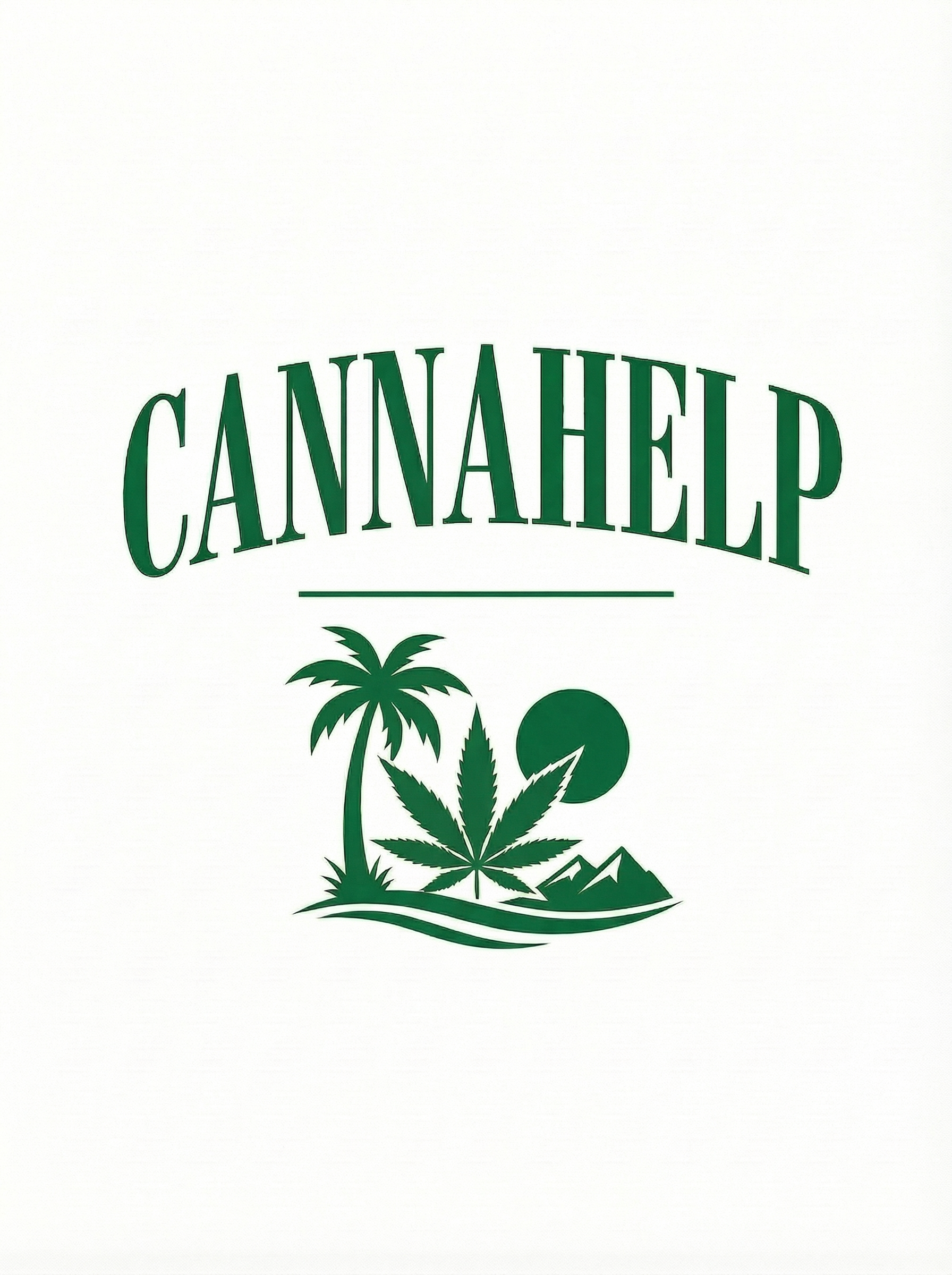
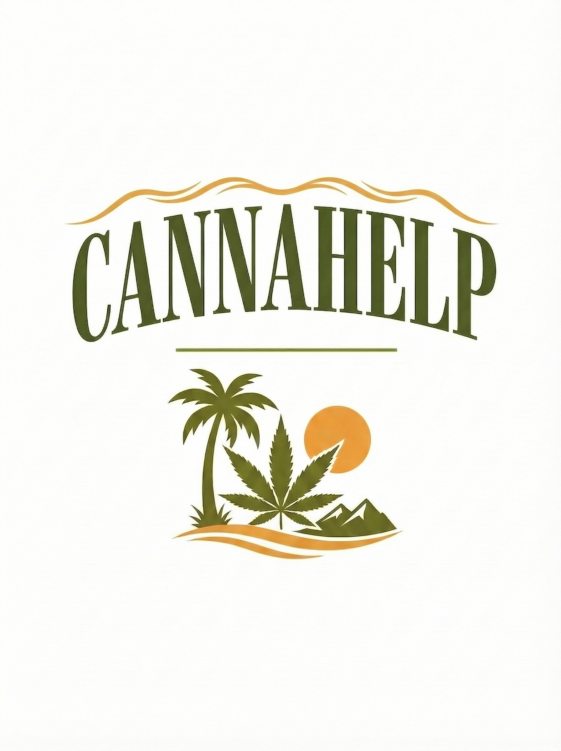
Client's Pick from v4
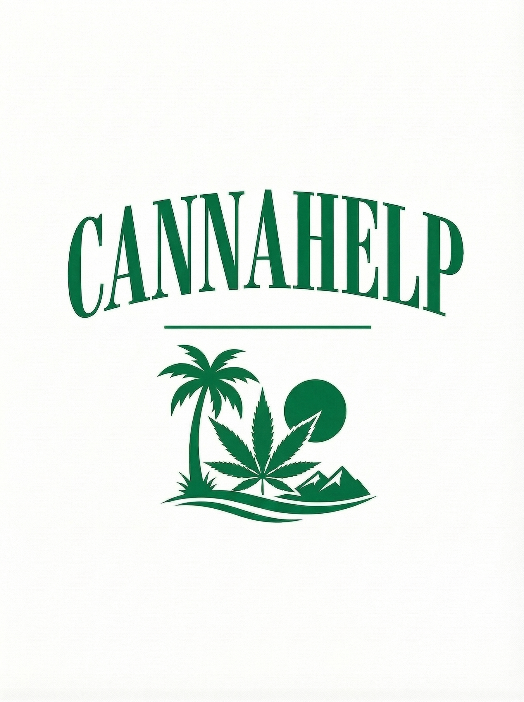
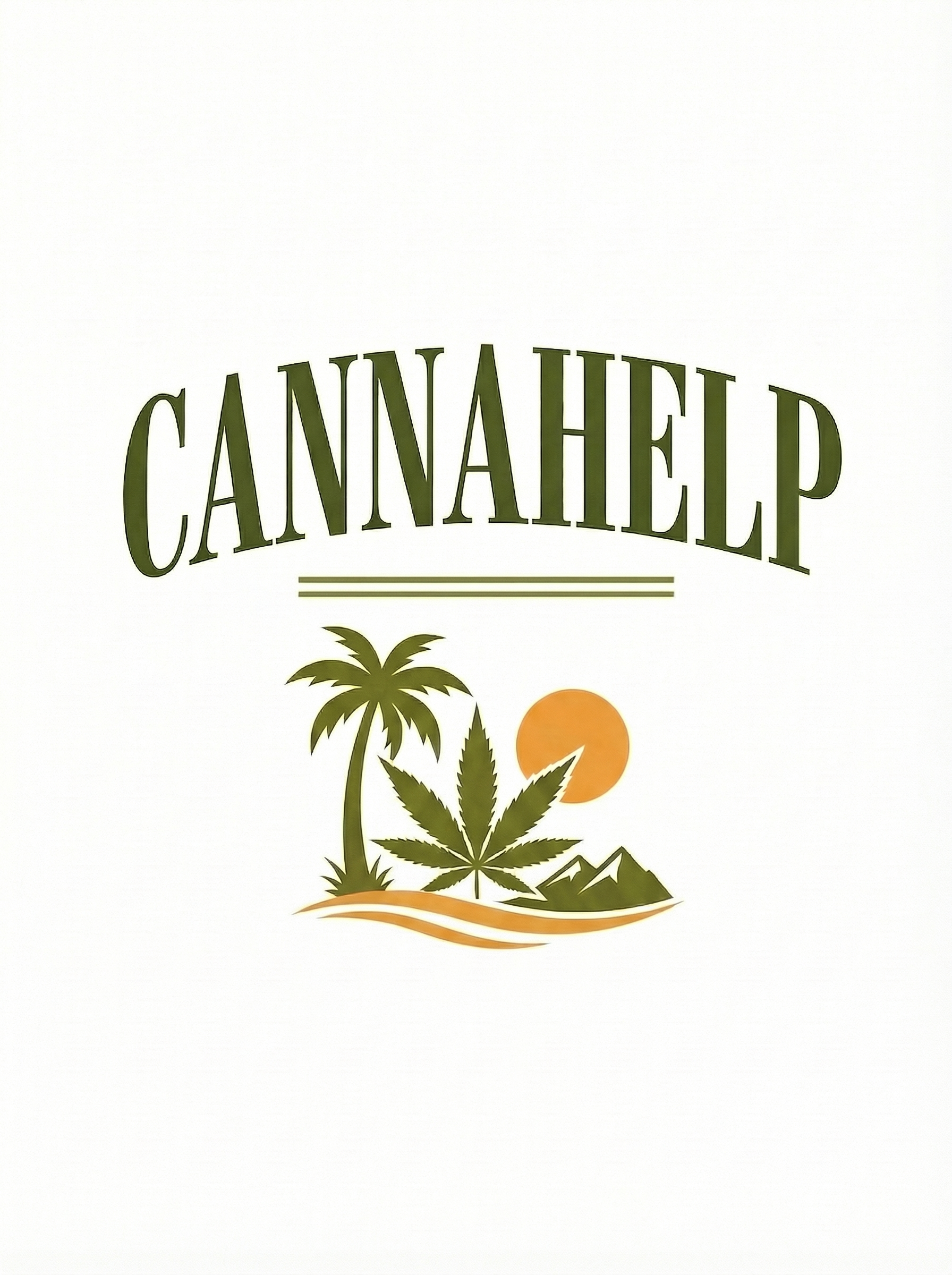
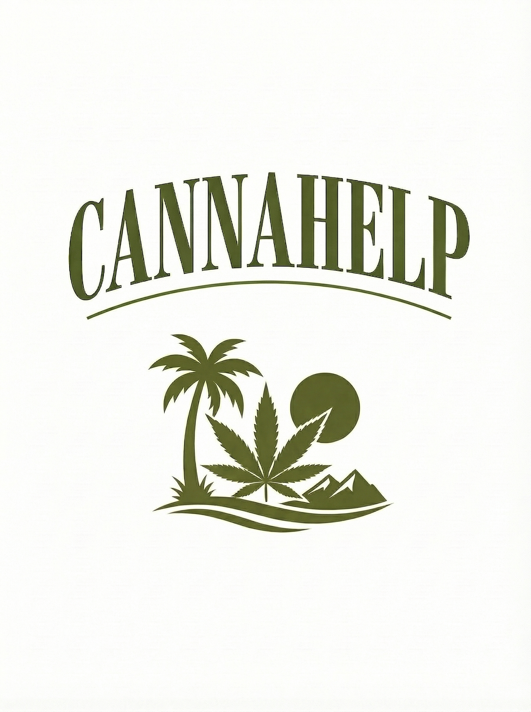
Concept 03 — Arched Baseline
Bodoni serif with a gentle upward arc, dark olive green, same desert emblem — palm, leaf, mountains, golden sun, wavy shoreline. This is the one. Now we're exploring subtle variations: spacing, weight, color, depth, and framing while keeping the soul of this mark intact.
Project Brief
Client: Olaf / CANNAHELP
Region: Coachella Valley, CA
Direction: Subtle variations of chosen Arched Baseline
Base: Concept #03 from v4 (Arched Baseline)
Scene Elements: Palm, leaf, mountains, sun, golden wave
Date: April 3, 2026
🟢 Monocolor Stamp Versions
Each variation includes a single-color brand mark — designed for packaging, merch, embossing, screen printing, and anywhere you need a simpler version. One color, full impact.
Variations
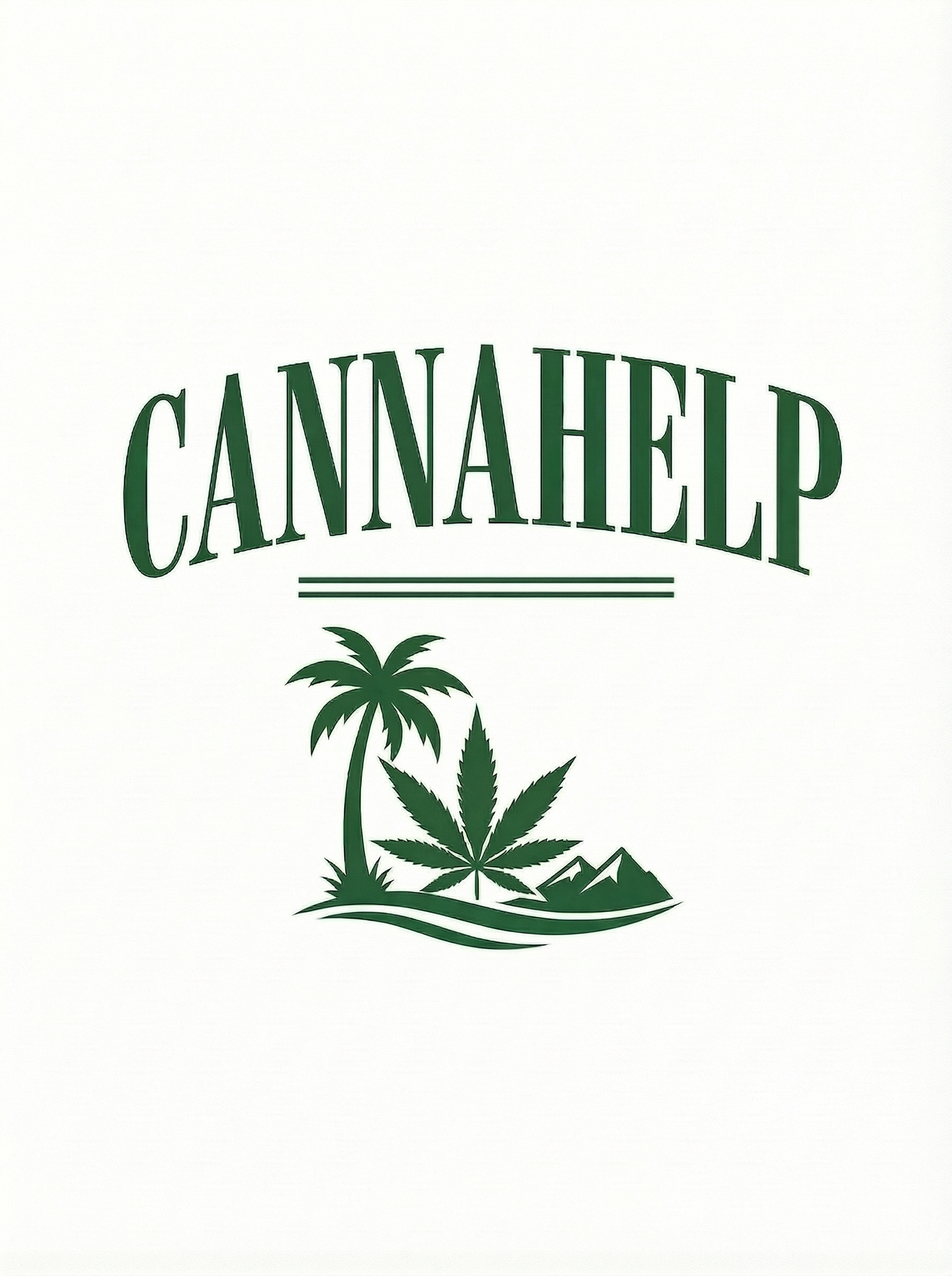
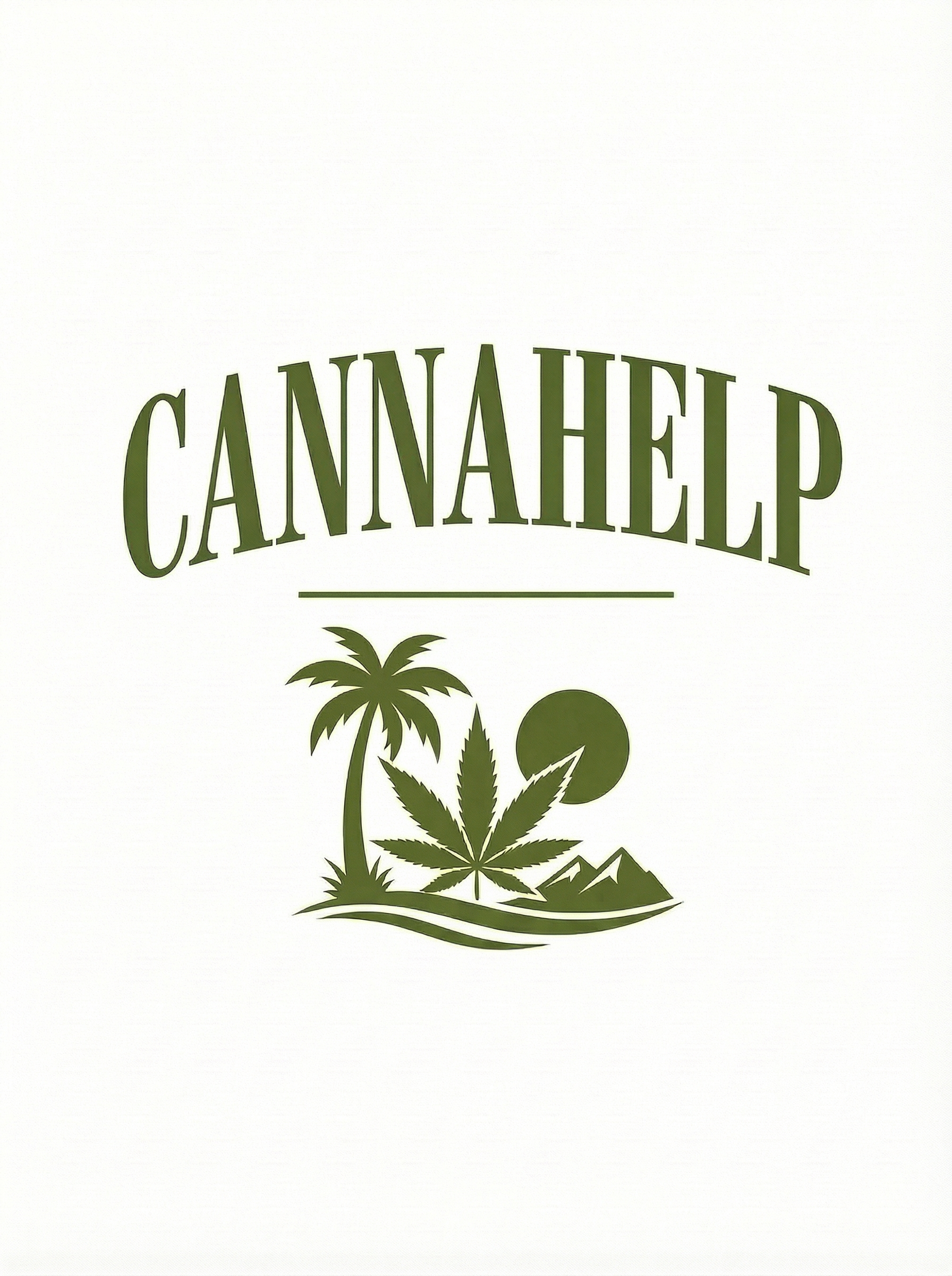
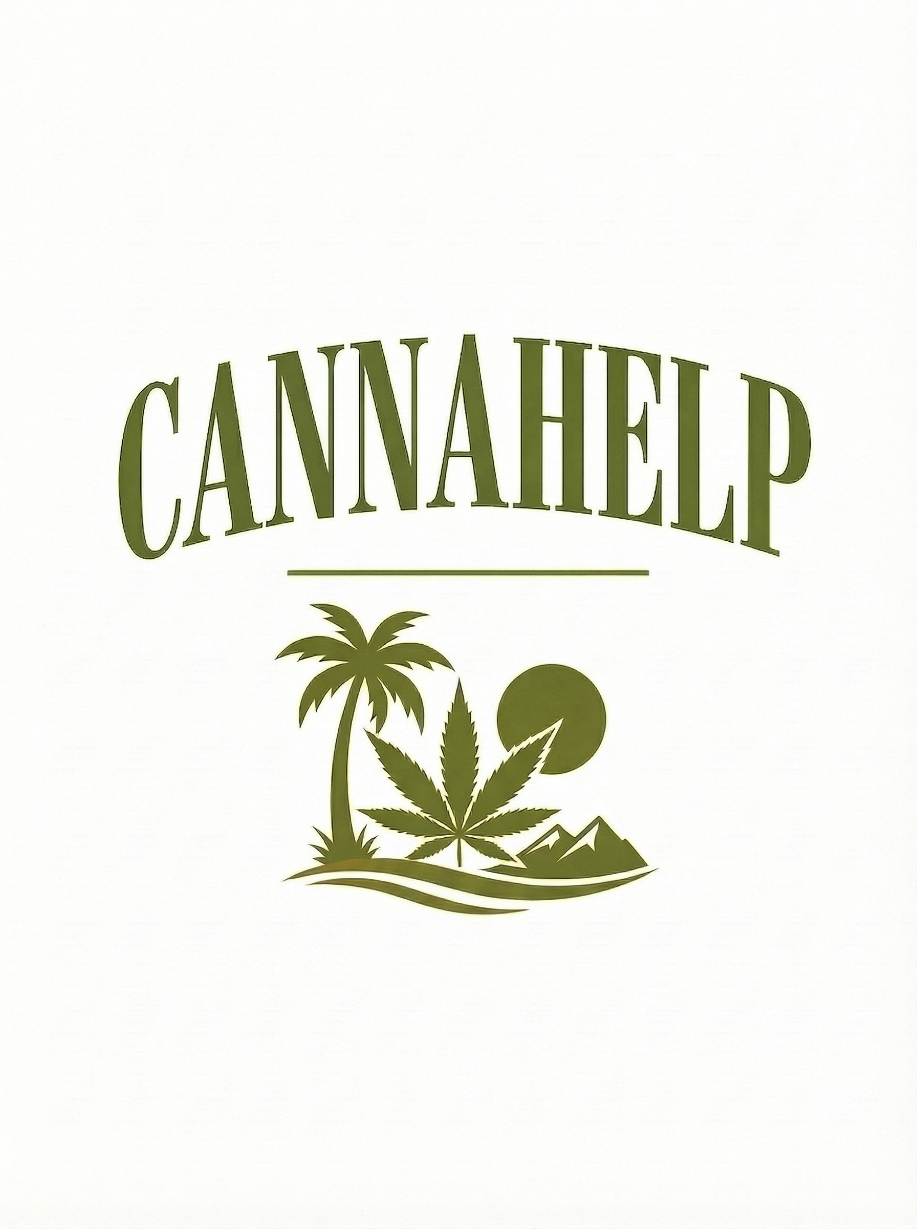
Variation 01
Tight Spacing
Same arched Bodoni serif, same emblem — but the letters sit closer together. A more compact, cohesive wordmark that feels solid and unified.
"Tighter letters, tighter brand. Nothing wasted."
Monocolor
Stamp Version
#1B5E20
Works on
- Packaging
- Stickers
- Merch
- Screen print

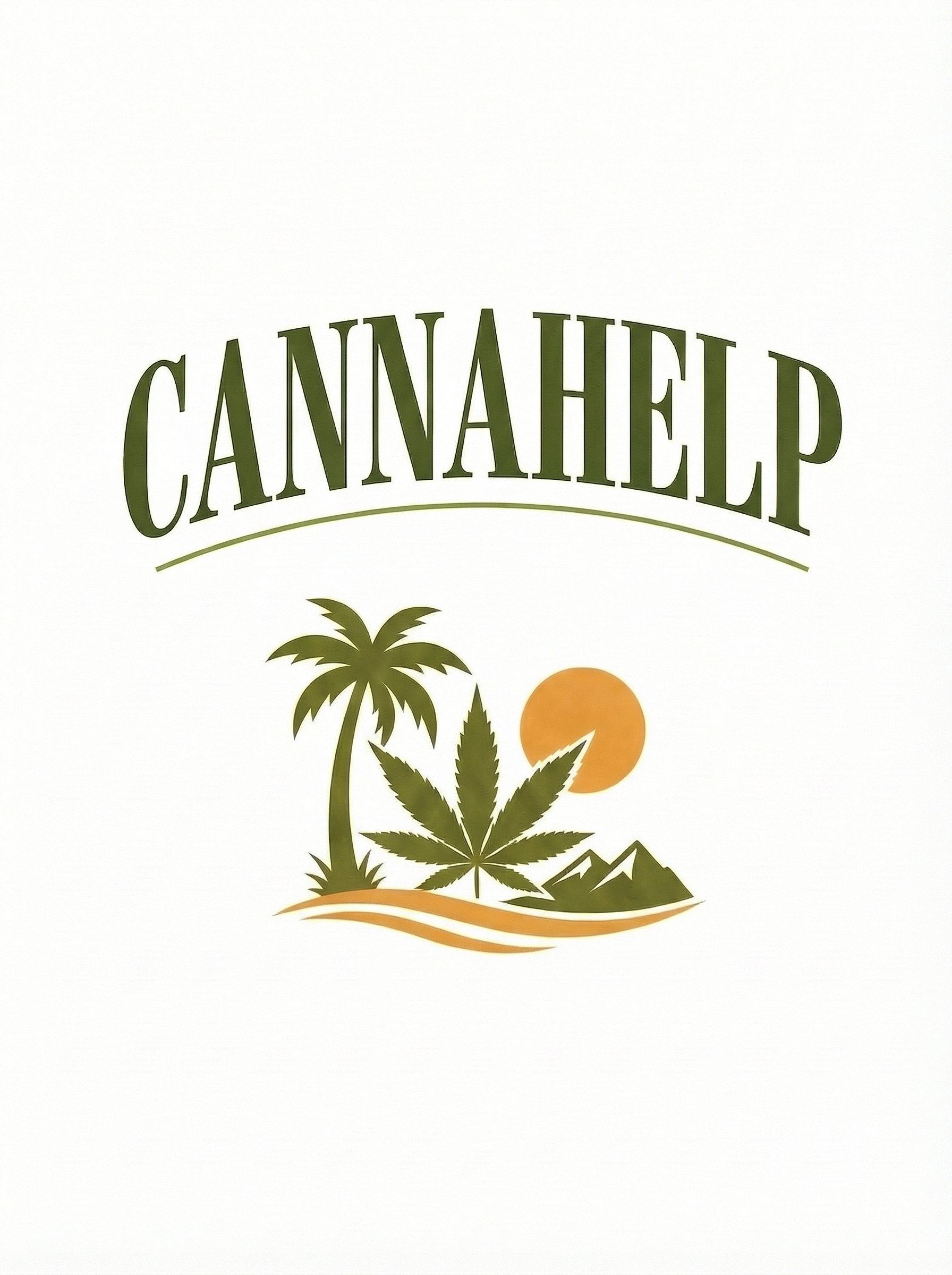
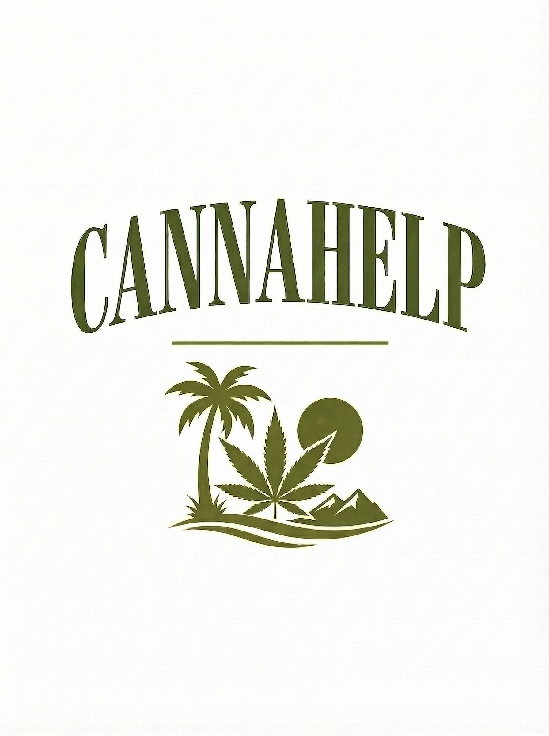
Variation 02
Wide Spacing
More air between each letter for a luxurious, premium feel. The extra breathing room gives the wordmark a relaxed confidence — like the brand has nothing to prove.
"Space is luxury. Let the letters breathe."
Monocolor
Stamp Version
#2D6B2D
Works on
- Packaging
- Stickers
- Merch
- Screen print
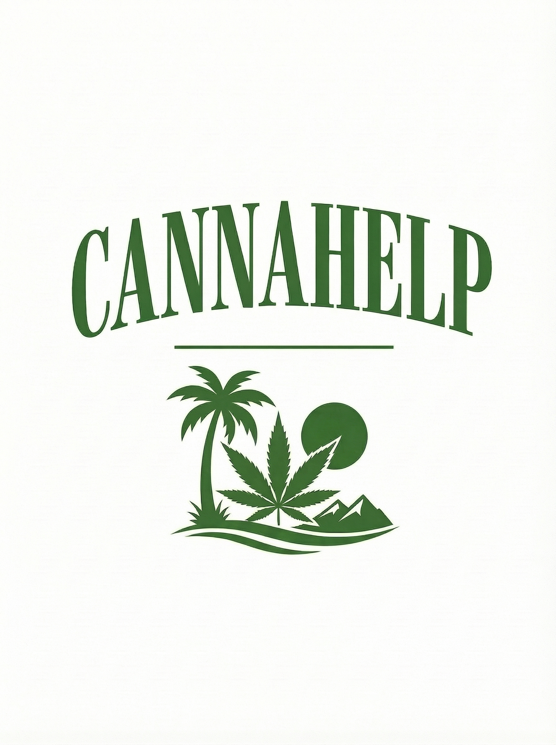
Variation 03
Deep Arc
A more pronounced upward curve — the arc bows higher, giving the text more dynamic energy. The original's gentle smile turned up a notch.
"More curve, more character. The arch becomes a signature."
Monocolor
Stamp Version
#1B4332
Works on
- Packaging
- Stickers
- Embossing
- Screen print
Variation 04
Double Rule
Twin parallel divider lines between the text and emblem instead of one. A small detail that adds structure and a touch of formality to the composition.
"Double the line, double the intention. Details matter."
Monocolor
Stamp Version
#2D7A3A
Works on
- Packaging
- Stickers
- Merch
- Screen print

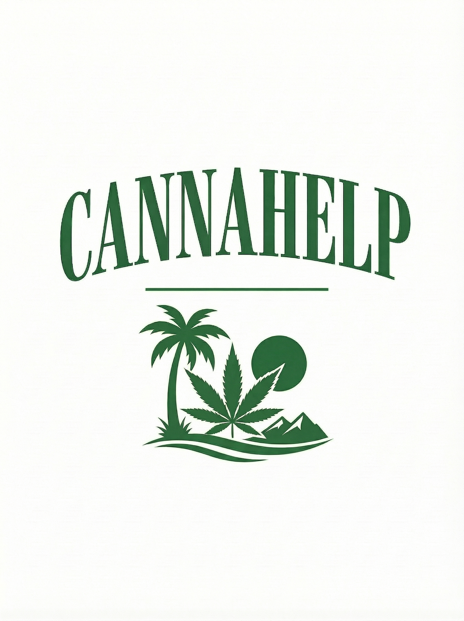
Variation 05
Italic Lean
Bodoni italic — same thick-thin contrast and arched baseline, but the letters lean forward. Adds a sense of motion and elegance, like the brand is going somewhere.
"Forward-leaning. The brand that doesn't stand still."
Monocolor
Stamp Version
#4A7C2E
Works on
- Packaging
- Stickers
- Merch
- Screen print
Variation 06
Larger Emblem
Same text, but the desert scene below is scaled up — the emblem commands more visual real estate. The landscape becomes the hero, the text becomes the title card.
"Let the valley speak louder."
Monocolor
Stamp Version
#1E6B30
Works on
- Packaging
- Stickers
- Embossing
- Screen print

Variation 07
Forest Green
A richer, more saturated forest green replaces the original olive. Deeper and more vibrant — the same mark with a bolder color voice.
"Same roots, deeper green. Nature turned up."
Monocolor
Stamp Version
#3A8F3A
Works on
- Packaging
- Stickers
- Merch
- Screen print

Variation 08
Cap Graduation
The C and P (first and last letters) are subtly larger than the middle letters — a custom typographic touch that frames the word and gives it a hand-crafted feel.
"Bookended. The beginning and end hold everything together."
Monocolor
Stamp Version
#1B5E20
Works on
- Packaging
- Stickers
- Merch
- Screen print

Variation 09
Shadow Depth
A subtle sage green drop shadow sits behind each letter — adding just enough dimension to make the text pop without competing with the emblem below.
"Depth without drama. The letters lift off the page."
Monocolor
Stamp Version
#2D6A2E
Works on
- Packaging
- Stickers
- Embossing
- Screen print
Variation 10
Golden Frame
A thin golden-orange ornamental accent sits above the arched text — echoing the golden wavy lines at the base. Top and bottom bookend the composition with warmth.
"Framed by the valley's golden light."
Monocolor
Stamp Version
#1B6B35
Works on
- Packaging
- Stickers
- Merch
- Screen print
What We're Exploring
All 10 are the same mark Olaf chose — Concept #03 Arched Baseline from v4 — with subtle typographic and compositional shifts. Same emblem, same soul. We're dialing in the letter treatment that feels right.